Green, red, blue – these basic colors appear in almost every commercial and on most posters. When you think of “Coca-cola”, you immediately think of the red logo. It’s similar with brands like Milka – you automatically associate them with the color purple.
There is a specific reason why this is so: every color triggers a certain emotional effect in our brain. This should be positive, otherwise the product will most likely not be purchased or recognized. The color selection for advertisements or products is therefore enormously important.
Color selection in the advertising industry
A survey by the Berlin advertising agency “Webstyle” has shown that colors can increase the recognition value of a brand or a product by up to 80% and are a decisive factor in 85% of whether a product is bought or not.
To find the “perfect” color for your product/brand the following points are recommended:
- The color should be adapted to the target group.
- It should be different/stand out from other providers.
- The color tone should match the message of your own company.
- With several shades it is important that the colors harmonize with each other
Red – the color of passion
Red attracts attention, emphasizes the irresistibility and power of a product and suggests powerful energy, confidence and performance. The color red can stimulate the appetite and is often used for sweet, hot and spicy products.
As already mentioned, probably the most famous and “reddest” product: Coca-Cola.
Blue – the color of practicality and confidence
The color blue is associated with soothing things like the water, the sky, but also freedom and longing. This color is often used for dairy products, usually in the combination of blue and white, because they look very fresh. Chewing gums, such as Orbit or Airwaves, are also packaged in blue to imply the effect of freshness. Nivea and Tempo are brands that our grandparents already bought and are still very present today. Maybe it’s because of their blue design?
Combined with gold, yellow or orange, blue looks very royal and noble.
Green – the color of hope
To be able to define the color green, keywords such as nature, harmony, life or peace often fall.
Green is associated with nature and health, most noticeably in the food industry. Brands like “Ja natürlich!” or “Zurück zum Ursprung” all have this color on their products. Even cleaning products, example: the “frog” products, are also all in green to convey to the buyer that he is buying environmentally friendly items.
Our Tip:
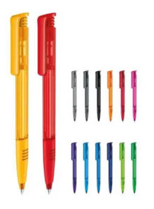
When choosing promotional products, pay attention to the effect of each color in addition to matching your corporate colors.
